


CLIENT
Hermes Korea
CATEGORY
Printing
Printing 에르메스 미스터리 앳 더 그룸즈
본문
2026년 6월 6일부터 16일까지 서울 DDP에서 진행된 에르메스 ‘MYSTERY AT THE GROOMS’의 포스터, 게임북 형태의 노트(VIP/PUBLIC), 초대장, 티켓, 행사용 입장팔찌, 행사 저널 등 제작물 전반에 대한 한글 타이포그래피 로컬라이징과 국내 제작을 진행했습니다.
From June 6 to 16, 2026, Hermès presented ‘MYSTERY AT THE GROOMS’ at Dongdaemun Design Plaza (DDP) in Seoul. HEXAIN handled the Korean typography localization and local production of the event’s full range of materials, including posters, gamebook-style notebooks for VIP and public guests, invitations, tickets, admission wristbands, and an event journal.
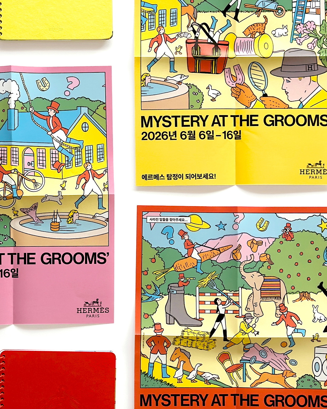
제작물 전반에 걸쳐, 해외에서도 진행되었던 행사의 일러스트와 레이아웃을 유지하면서 행사명과 일정, 문구 등을 한글로 적용했습니다. 영문과 다른 한글의 폭과 문장 길이를 고려해 글자 크기와 자간, 행간, 줄바꿈을 다시 조정하고, 원안의 정보 위계와 여백이 달라지지 않도록 구성했습니다. 핑크, 옐로, 오렌지 등 넓은 면적의 컬러가 원본과 유사하게 표현되도록 종이와 인쇄 발색을 수차례 테스트했으며, 접었을 때와 펼쳤을 때 모두 주요 정보가 자연스럽게 보이도록 접지와 재단 위치를 확인했습니다.
Across all materials, we retained the illustrations and layouts created for previous international editions of the event while adapting the event title, schedule, and accompanying copy into Korean. To accommodate the different character widths and sentence lengths of Korean, we recalibrated the type size, tracking, leading, and line breaks to preserve the original hierarchy and balance of white space. Multiple paper and print tests were conducted to reproduce the large areas of pink, yellow, and orange as closely as possible. Fold and trim positions were also checked to ensure that key information remained naturally positioned whether the materials were folded or fully opened.
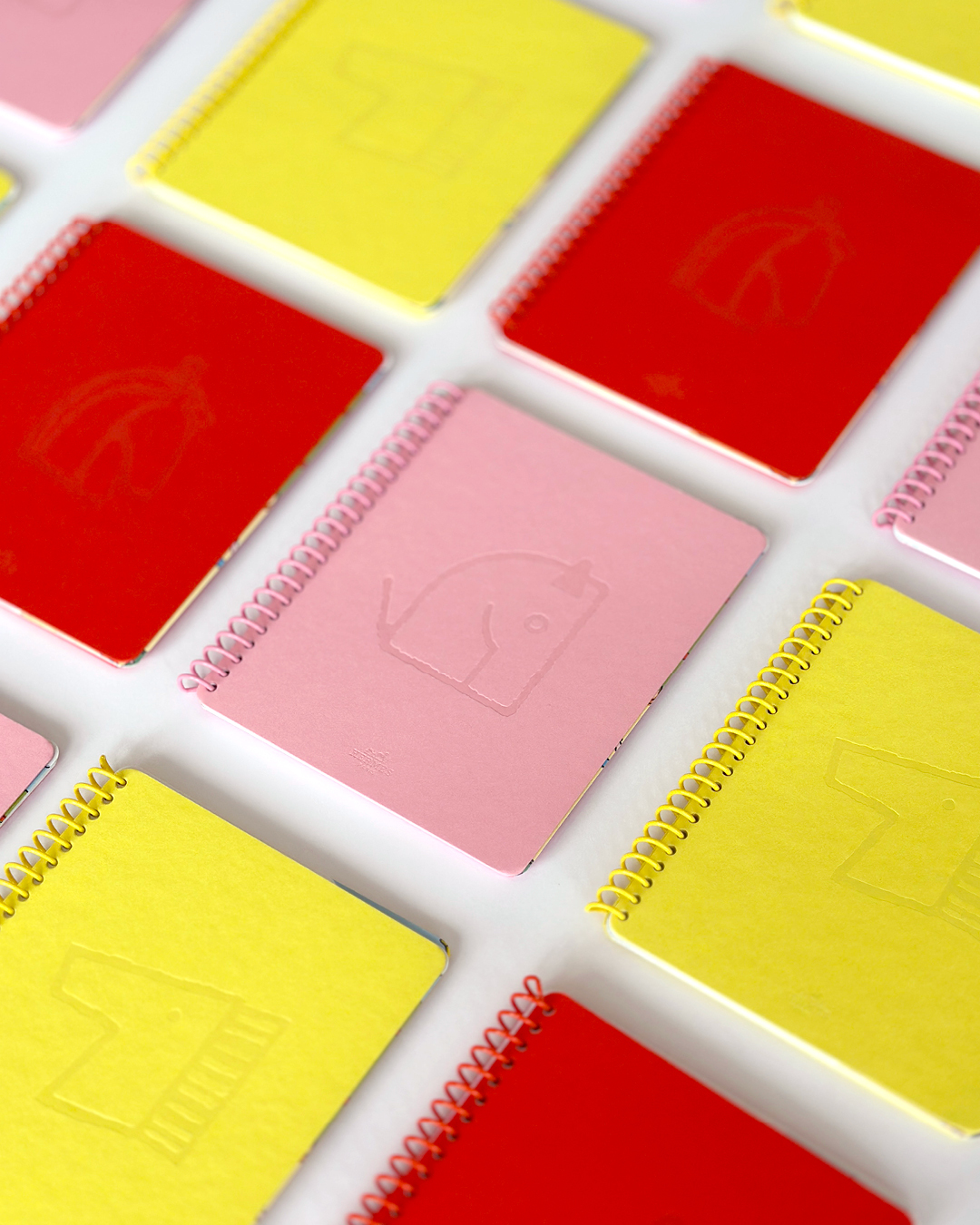
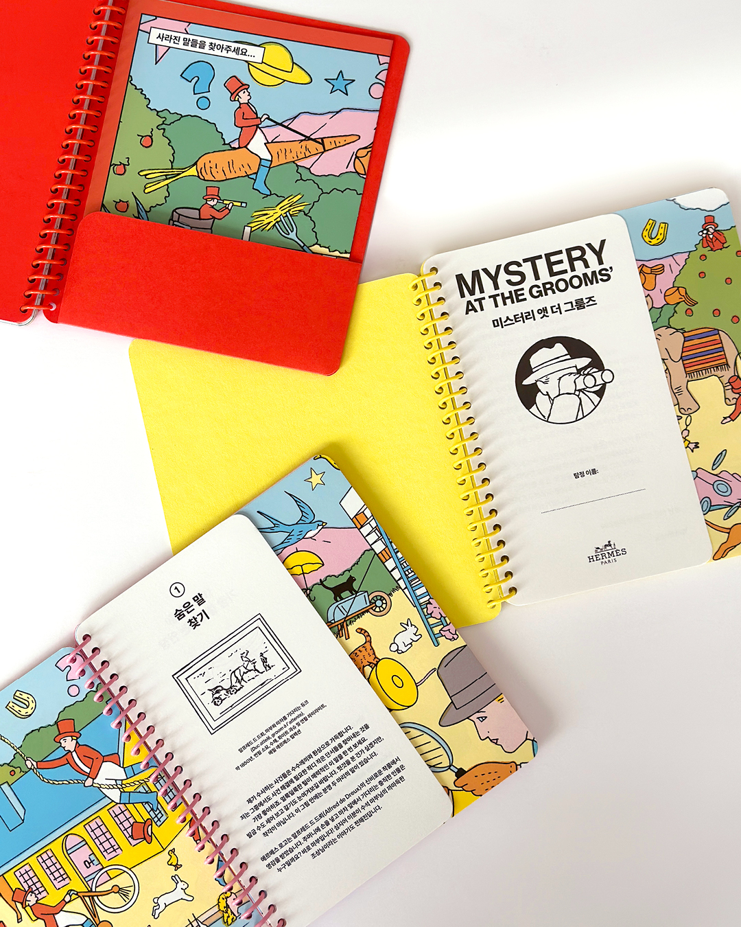

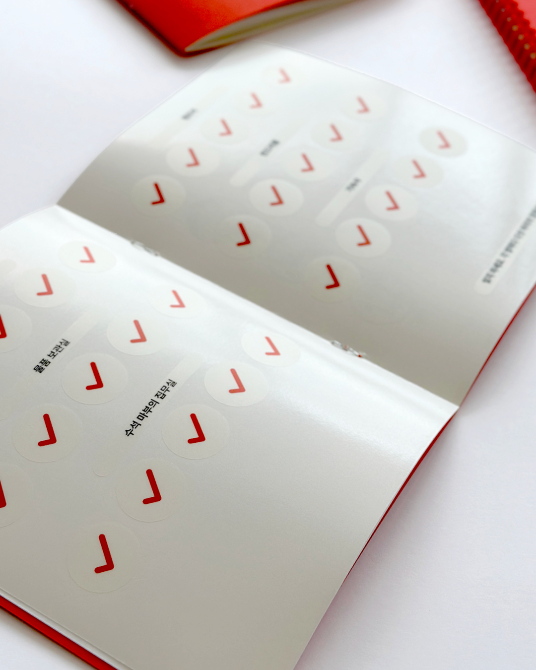
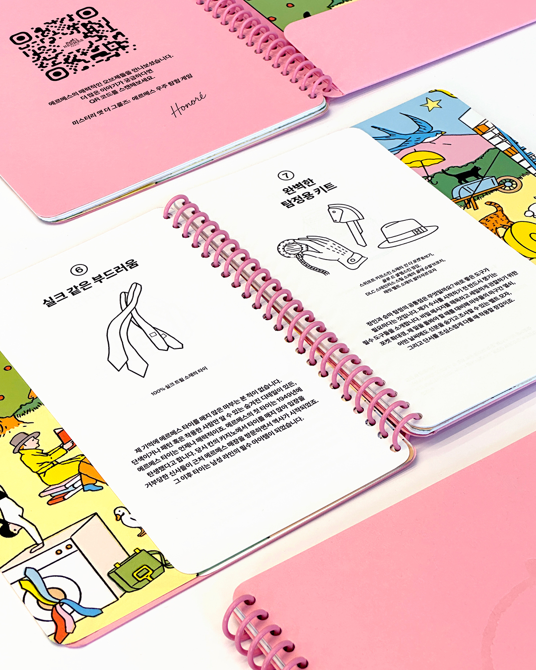
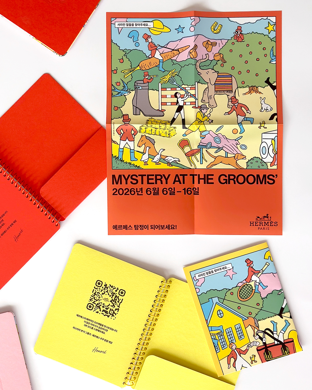

행사의 게임북으로 사용되는 스프링 노트는 다양한 컬러의 표지에 그래픽을 표현하고, 표지와 동일한 계열의 컬러 스프링을 제작하여 적용했습니다. 한글로 로컬라이징한 스토리와 단서, 미션 안내, QR 정보가 삽입된 노트(VIP / PUBLIC)는 작은 판형에서도 내용이 명확하게 읽히고 일러스트와 텍스트가 자연스럽게 이어지도록 글자들의 밀도를 조정했으며, 모서리 라운드와 합지방, 타공 위치와 제본 간격도 원본 샘플과 비교해 제작했습니다.
The spiral-bound notebooks, used as gamebooks during the event, featured graphic treatments across a variety of cover colors, paired with custom-made spiral bindings in matching hues. Inside, we arranged the Korean-localized story, clues, mission instructions, QR information, and sticker sheets. Text density was carefully adjusted to maintain clarity within the compact format and to create a natural flow between the typography and illustrations. Corner rounding, board lamination, punch alignment, and binding intervals were also produced in close comparison with the original samples.
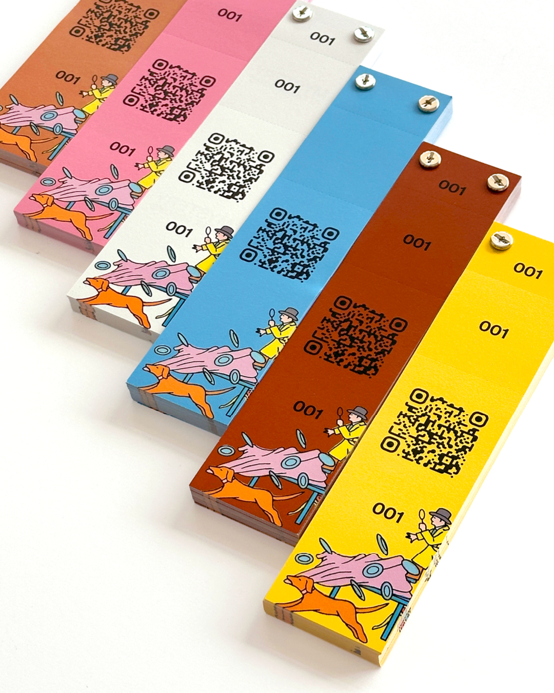
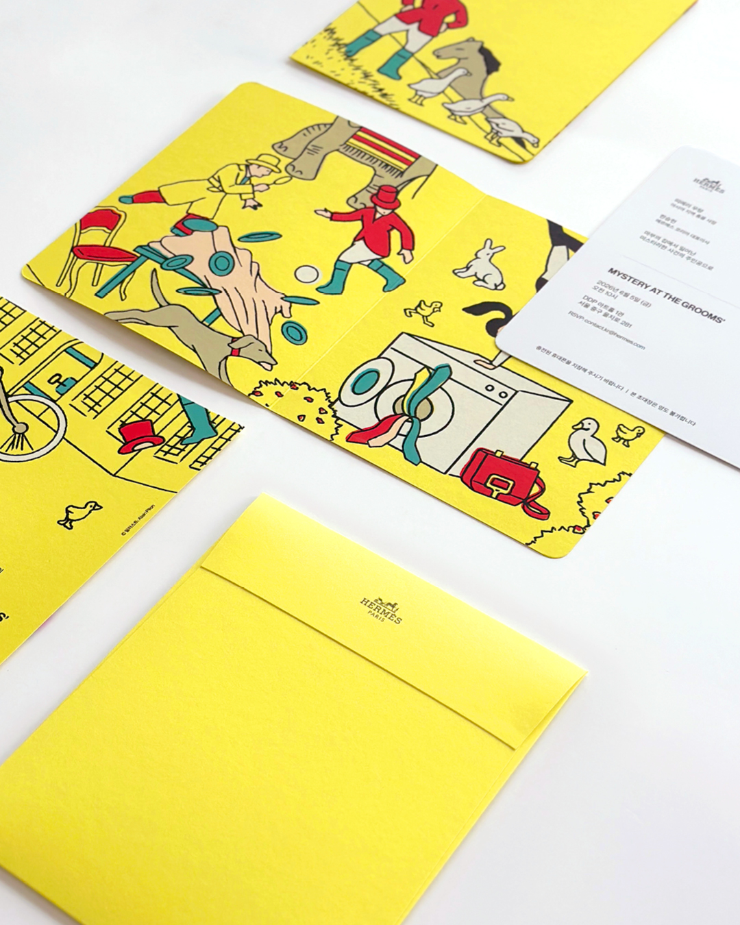
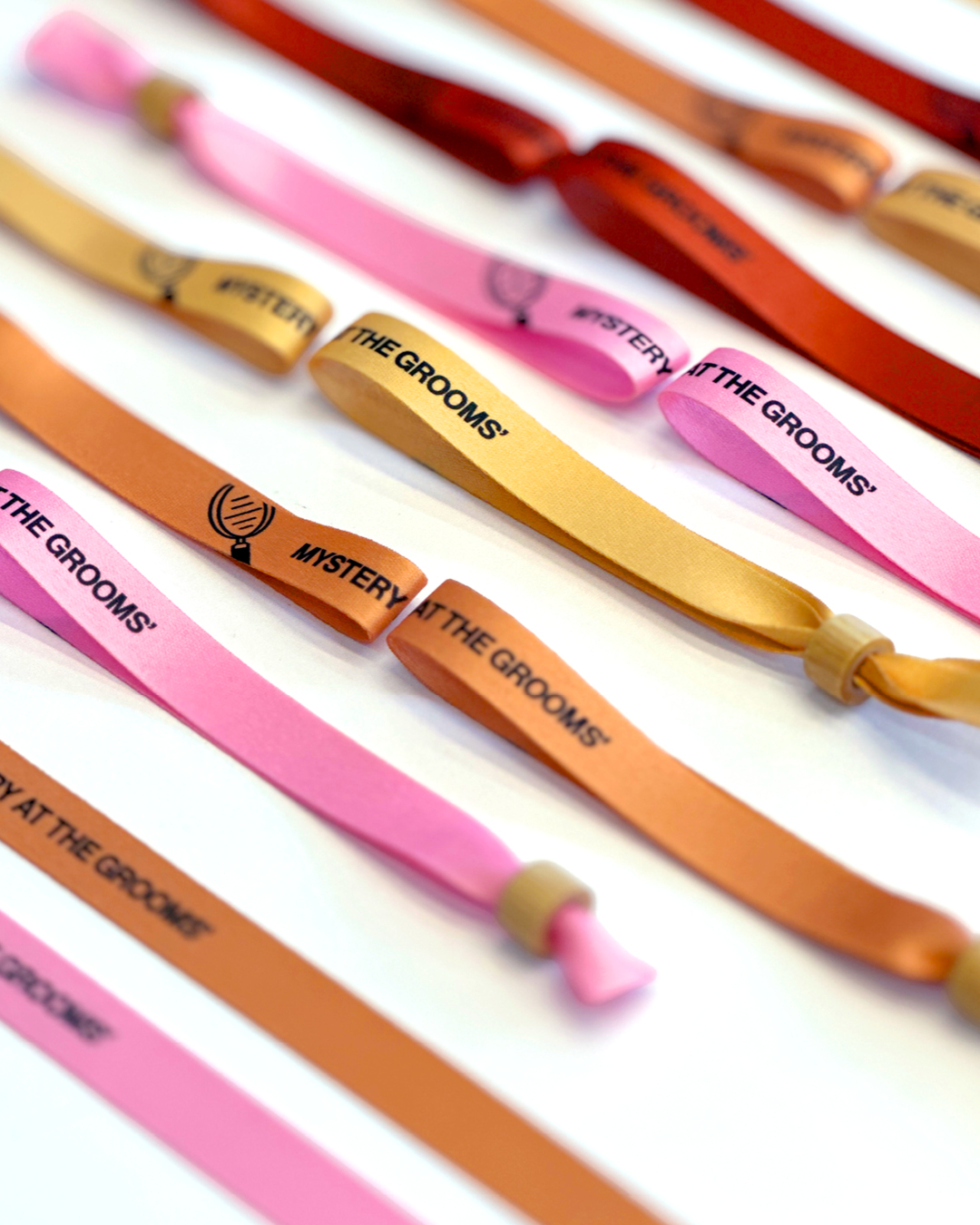
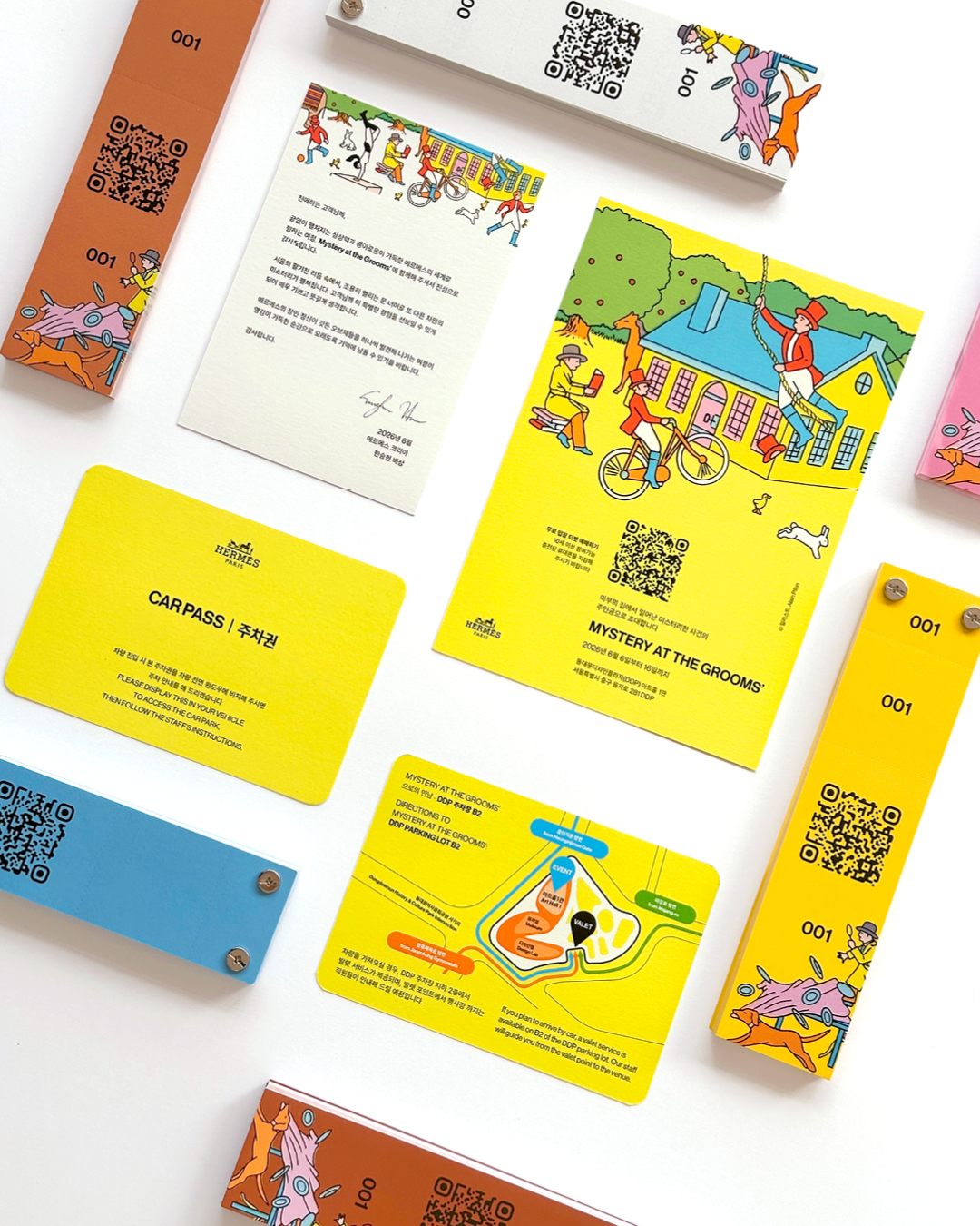
초대장과 봉투, 티켓, 패브릭 팔찌 등 나머지 제작물 역시 해외 샘플의 구조와 소재, 컬러를 기준으로 국내 제작 환경에 맞춰 구현했습니다. 티켓에는 QR 코드와 개별 번호를 적용하고 절취 단위와 금속 체결 방식까지 원본과 유사하게 제작했습니다. 패브릭 팔찌는 캠페인의 주요 컬러와 그래픽을 적용해 종이 제작물과 동일한 인상이 이어지도록 원단과 인쇄 상태를 구현하였습니다.
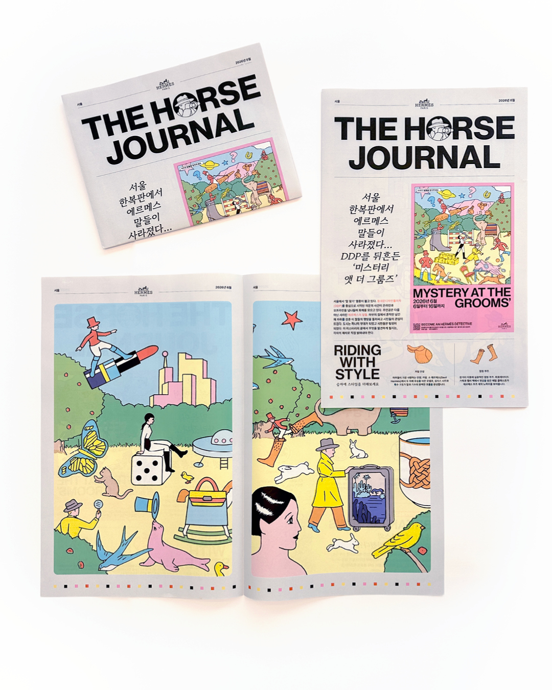
행사 소식과 스토리를 신문 형식으로 구성한 ‘THE HORSE JOURNAL’은 원안의 대담한 헤드라인과 편집 구조를 유지하면서 한글 기사의 길이와 글자의 짜임새를 조정했습니다. 실제 신문용지를 접어놓은듯한 종이 선택과 인쇄농도 조절과 더불어, 컬러 일러스트와 타이포그래피가 선명하게 표현되도록 진행하였습니다.
같은 색상도 소재에 따라, 질감, 잉크의 흡수율과 건조 상태에 따라 다르게 표현됩니다. 본 생산 전 샘플을 해외 제작물과 반복해 비교하며 인쇄와 재단, 접지, 박가공, 제본 상태를 공정별로 검수했습니다.
The invitations, envelopes, tickets, and fabric wristbands were similarly reproduced for the Korean production environment based on the structures, materials, and colors of the international samples. Each ticket included a QR code and individual serial number, while its tear-off format and metal fastening method were developed to closely match the original construction. The wristbands incorporated the campaign’s key colors and graphics, with particular attention paid to the fabric and print quality so that they maintained the same visual character as the paper-based materials.
‘THE HORSE JOURNAL,’ which presented event stories and information in a newspaper format, retained the bold headlines and editorial structure of the original while adjusting the length, spacing, and overall composition of the Korean text. The paper stock was selected to recreate the tactile quality of a folded newspaper, while the print density was calibrated to ensure that both the color illustrations and typography remained crisp and legible.
Even the same color can appear different depending on the paper’s whiteness, texture, ink absorption, and drying conditions. Before full production, we repeatedly compared samples with the international references and inspected each stage of the process, including printing, trimming, folding, foil stamping, and binding.
없는 것을 만드는 것보다, 이미 존재하는 완성도를 동일하게 구현하는 일이 때로는 더 어렵습니다. 이번 프로젝트는 단순히 디자인을 넘어, 에르메스가 구축한 시각적 기준과 과거의 사례에서 브랜드가 요구하는 기준을 읽어내고 그에 적합한 제작 방식과 솔루션을 스스로 찾아 구현한 과정이었습니다.
Creating something from scratch is not always more difficult than reproducing an existing standard with precision. Rather than receiving fully prescribed production specifications, we had to interpret the intended quality and construction from previous samples and precedents, then determine the most appropriate materials, processes, and solutions ourselves. This project went beyond design alone, carrying the visual and production standards established by Hermès into a different language and local manufacturing environment.
- 이전글AION2 X 엔비디아 서프라이즈 라이브 26.09.10
- 다음글가디언메이든 일러스타페스 행사 부스운영 26.08.25
댓글목록 0
등록된 댓글이 없습니다.