

CLIENT
미국육류수출협회
CATEGORY
Branding
Branding 아메리칸 버거위크 10주년
본문
헥사인은 수년간 미국육류수출협회가 주관하는 ‘아메리칸 버거위크’의 디자인을 맡아 행사의 성장을 함께해왔습니다. 미국산 소고기와 돼지고기를 활용한 수제버거를 소개하는 미식 축제로, 10회차를 맞은 2026년에는 전국 45개 수제버거 브랜드와 100여 개 매장이 참여한 이번 행사를 위해, 그동안 축적해온 행사에 대한 이해를 바탕으로, 다양한 참여 브랜드의 개성과 확장된 규모를 담아내는 키비주얼 및 프로모션 제작물 디자인을 진행했습니다.
HEXAIN has been the design partner for American Burger Week for several years, supporting the event as it has grown. Organized by the U.S. Meat Export Federation, the festival celebrates gourmet burgers made with U.S. beef and pork. Its 10th edition in 2026 brought together 45 burger brands across more than 100 locations nationwide. Drawing on our longstanding understanding of the event, we developed the key visual and promotional materials to reflect the distinct identities of participating brands and the festival’s expanding scale.

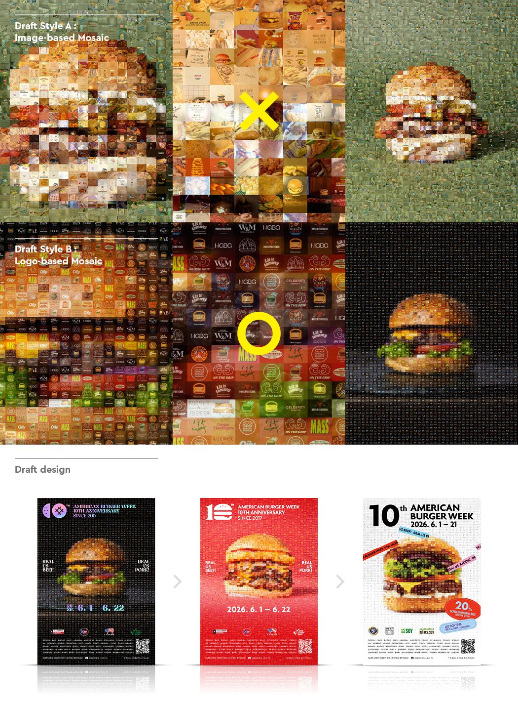
Draft Style A (Image-based Mosaic):
브랜드별 홍보 컷 및 광고 이미지를 활용. 다양한 시각 소스로 인해 전체적인 주제 의식이 흐려지고 시선이 분산되는 한계 확인.
Draft Style B (Logo-based Mosaic):
브랜드 로고 그래픽을 활용한 통일감 있는 구성. 시각적 노이즈를 줄이고 페스티벌의 핵심 주제를 명확하고 임팩트 있게 전달하도록 개선.
Draft design 확정
복잡성을 배제하고 주제 전달력을 높인 Draft Style B를 채택하여 프로젝트를 진행했습니다. 수많은 브랜드의 정체성을 정돈된 로고 모자이크로 녹여내어, 10주년 아메리칸 버거위크만의 아이덴티티를 확립한 최종 포스터 디자인을 도출했습니다.
Draft Style A (Image-based Mosaic)
This approach used promotional and advertising images from participating brands. The varied visual sources, however, diluted the central theme and created competing focal points.
Draft Style B (Logo-based Mosaic)
This approach used brand logos to create a more cohesive composition. By reducing visual noise, it communicated the festival’s central theme with greater clarity and impact.
Final Design Direction
Draft Style B was selected for its reduced complexity and stronger visual focus. The participating brands’ distinct identities were brought together in a carefully structured logo mosaic, resulting in a final poster that established a distinctive visual identity for the 10th edition of American Burger Week.
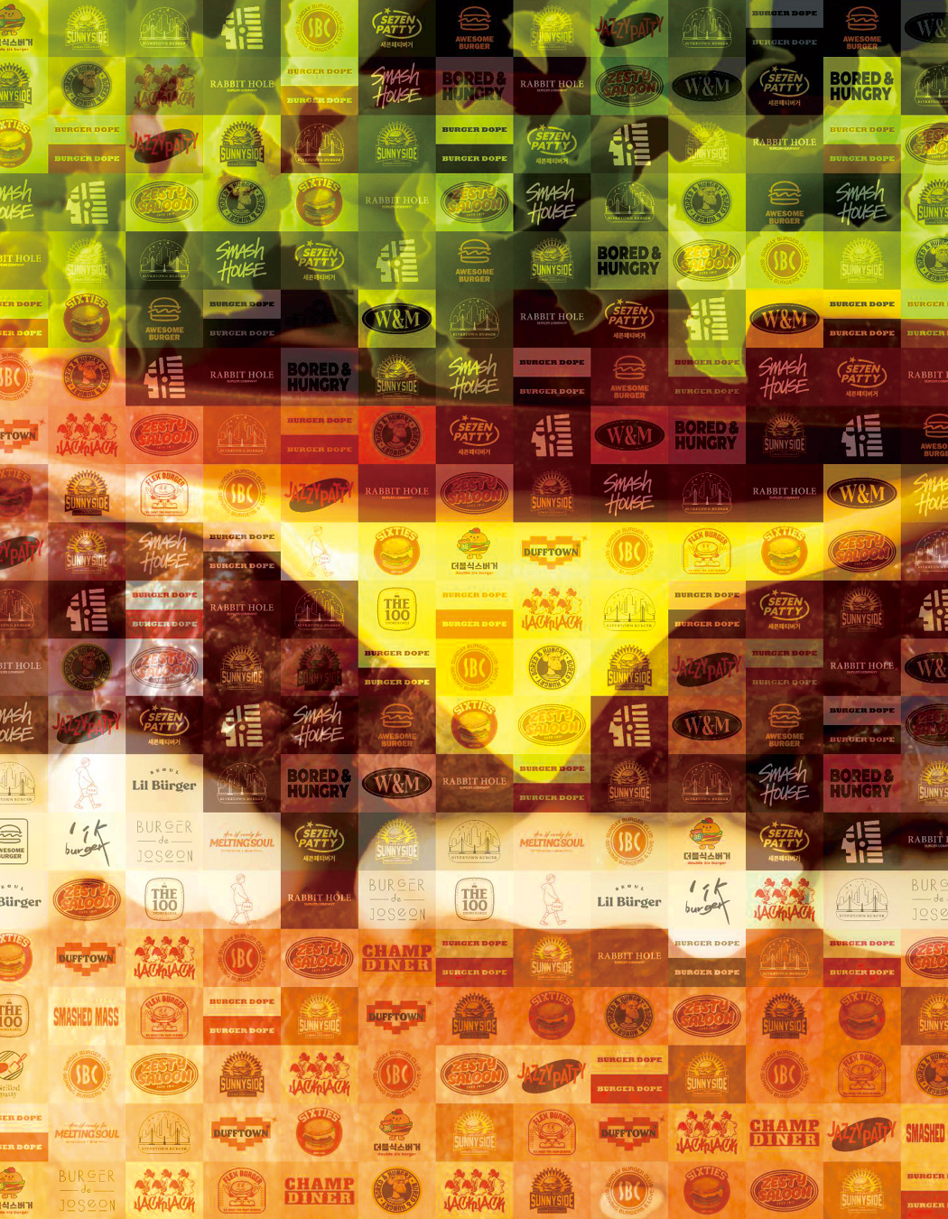
이번 키비주얼은 서로 다른 개성을 지닌 브랜드들이 모여 하나의 축제를 완성한다는 관점에서 출발했습니다. 참여 브랜드의 로고를 모자이크의 기본 단위로 활용하고, 이를 조합해 하나의 커다란 버거를 구현했습니다. 각기 다른 재료가 층을 이루며 버거를 완성하듯, 개별 브랜드의 정체성이 모여 행사의 풍성함을 드러내도록 구성했습니다. 가까이에서는 각각의 로고를 발견하고, 멀리에서는 버거의 형태를 인식할 수 있도록 크기와 밀도, 색상을 조율해 개별 브랜드의 존재감과 전체 이미지의 완성도를 함께 고려했습니다.
타이틀은 키비주얼의 시각적 인상이 온전히 전달되도록 정돈된 미니멀한 타이포그래피로 구성했습니다.
The key visual was conceived around the idea of individual brands coming together to create a shared celebration. We used their logos as the building blocks of a mosaic, assembling them into a single, large-scale burger. Just as layers of different ingredients form a complete burger, the brands’ identities collectively express the richness and variety of the event. The scale, density, and color of the logos were carefully balanced so that each could be discovered up close, while the overall burger image remained clear from a distance.
The title was set in clean, minimal typography, allowing the key visual to take center stage.
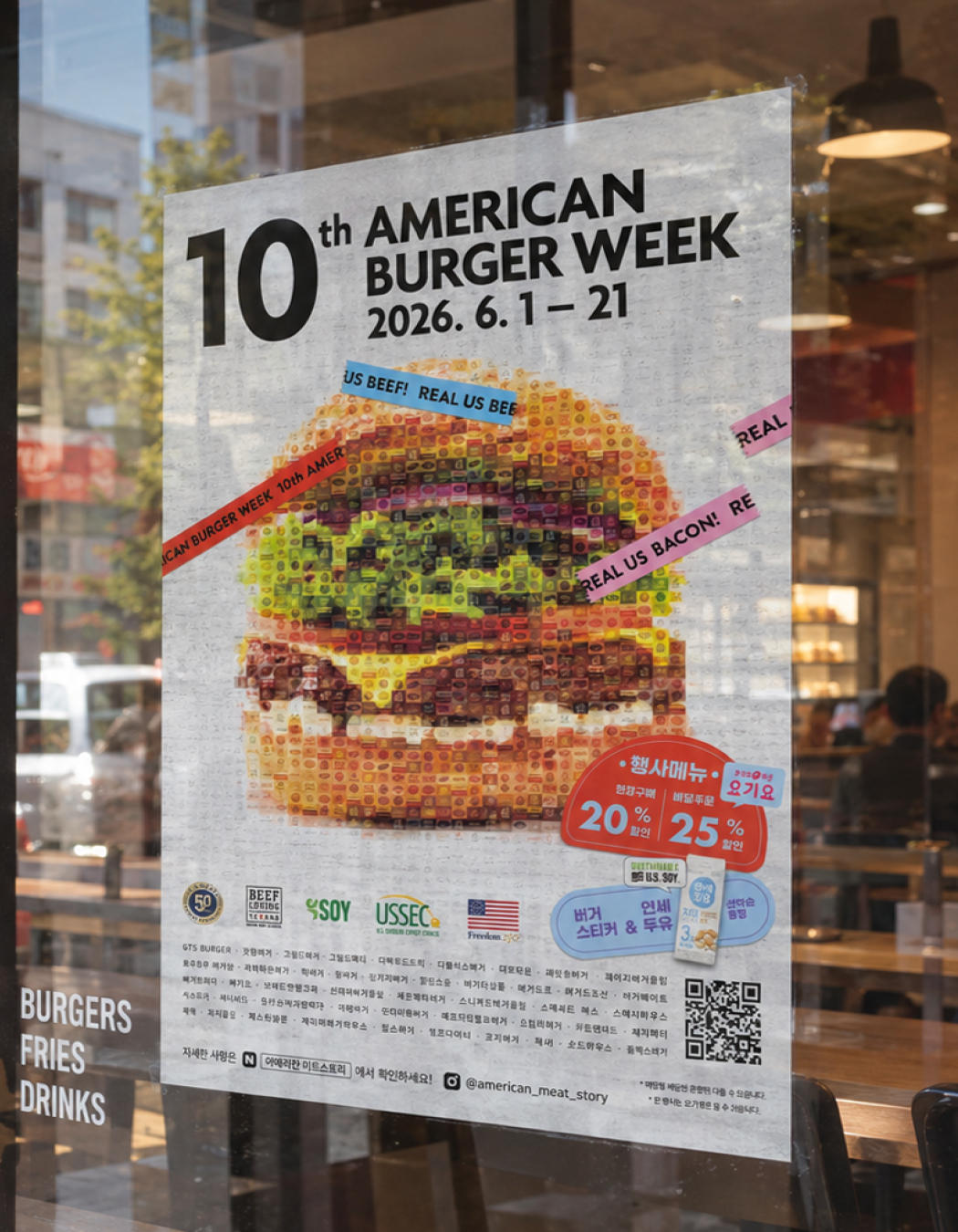
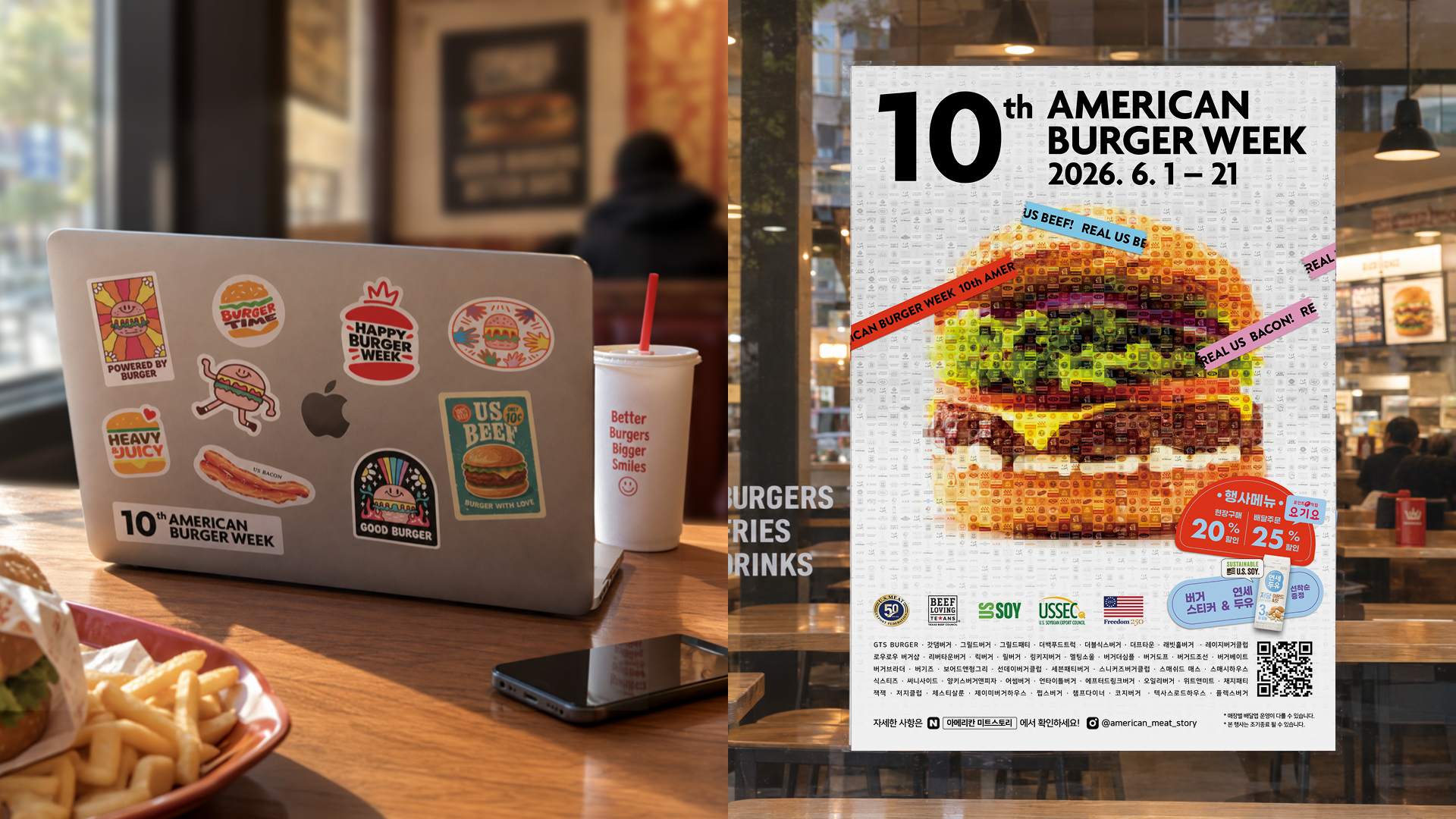
정돈된 타이포그래피와 여백으로 밀도 높은 모자이크 그래픽에 시선을 모으고, ‘10th’를 강조해 10회를 맞은 행사의 상징성을 전달했습니다. 사선으로 배치한 컬러 띠는 레이아웃에 리듬과 활기를 더하며 축제의 분위기를 표현했습니다.
Clean typography and generous white space brought focus to the intricate mosaic, while the prominent “10th” marked the event’s milestone edition. Diagonal bands of color introduced rhythm and energy, conveying the lively spirit of the festival.
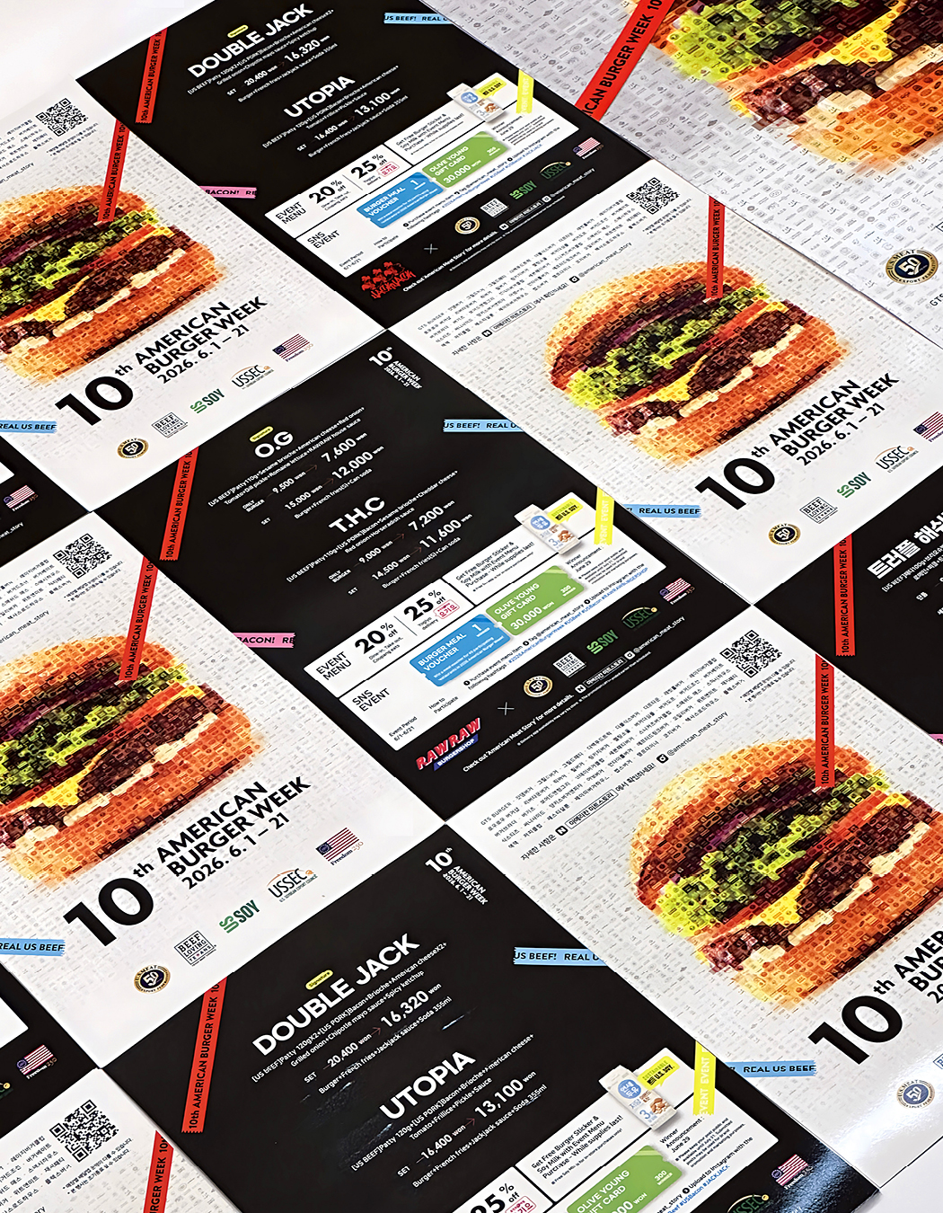
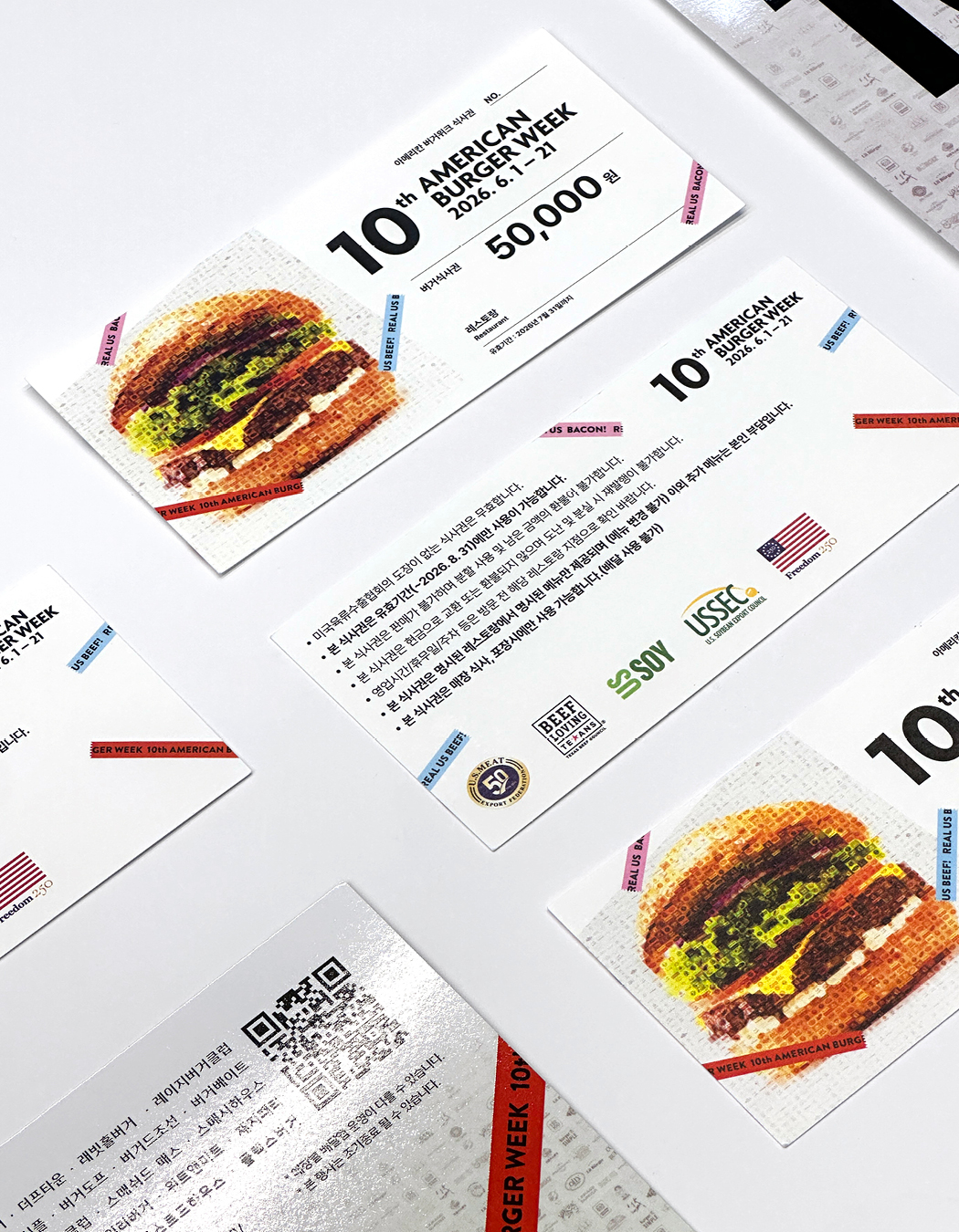
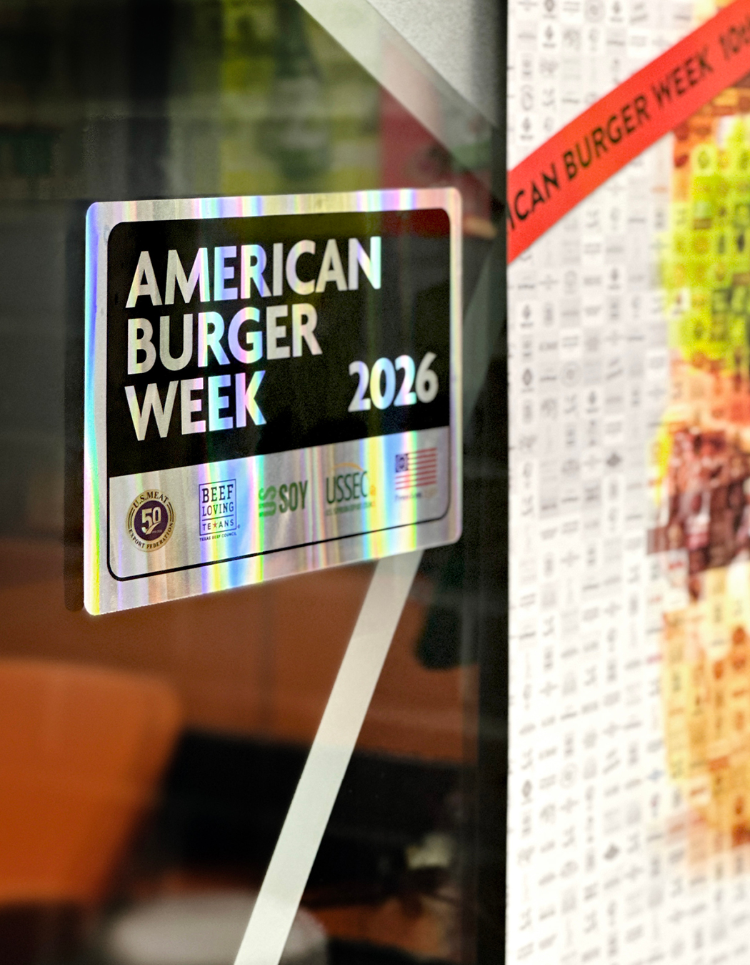
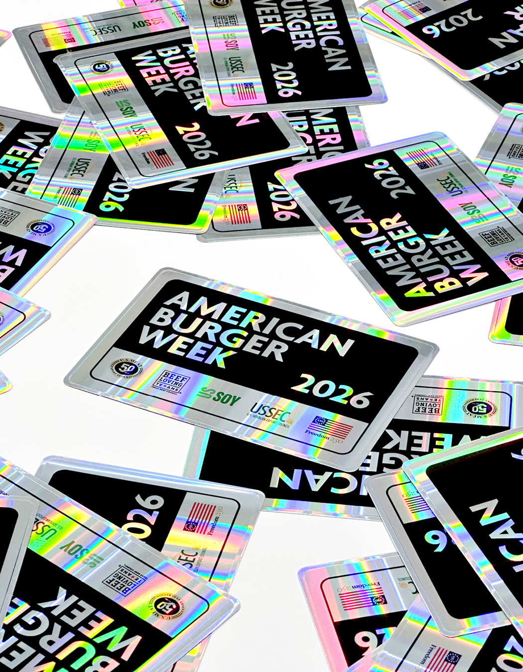

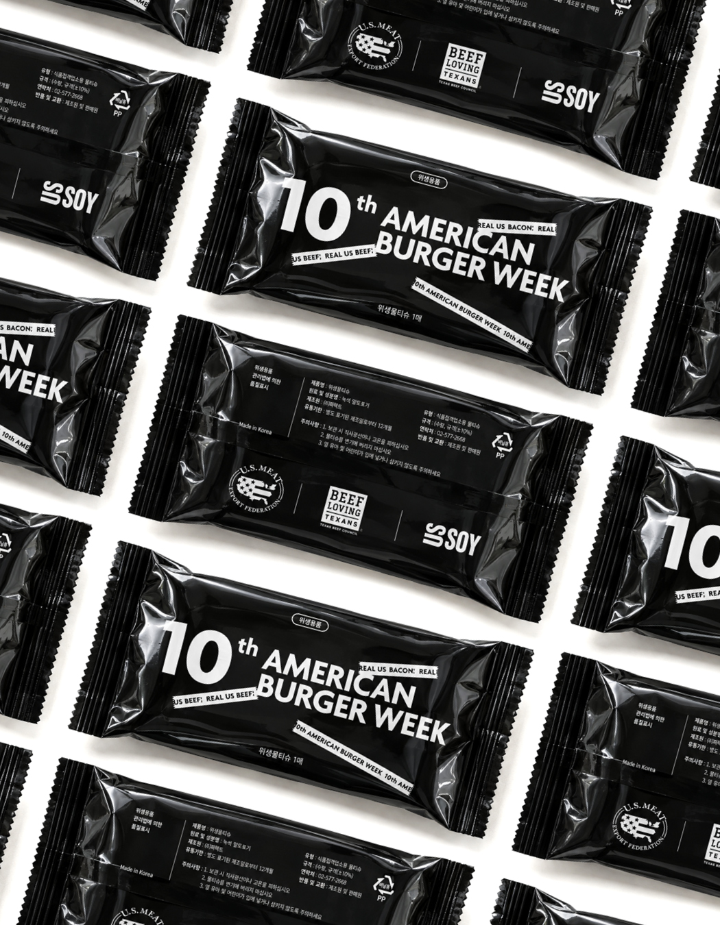
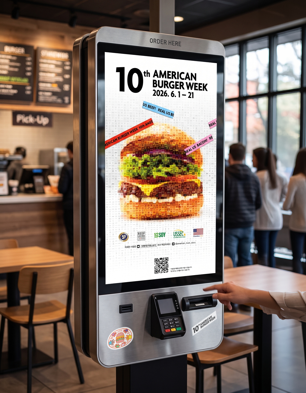
완성된 키비주얼은 포스터, 리플릿, 쿠폰, 매장 부착용 스티커와 디지털 홍보물 등 다양한 매체로 확장했습니다. 버거 문화를 경쾌하게 풀어낸 일러스트 스티커와 패키지 디자인을 함께 전개하며, 각기 다른 개성을 가진 참여 매장에서도 아메리칸 버거위크의 정체성이 일관되게 전달되도록 했습니다.
The visual identity extended across posters, leaflets, vouchers, storefront stickers, and digital promotional materials. Playful illustrations inspired by burger culture were also developed for stickers and packaging, creating a consistent American Burger Week identity across participating locations while embracing their individual character.

- 이전글에르메스 더블투어 초대장 26.09.15
- 다음글AION2 X 엔비디아 서프라이즈 라이브 26.09.10
댓글목록 0
등록된 댓글이 없습니다.