


CLIENT
Hermes Korea
CATEGORY
Printing
Printing 에르메스 더블투어 초대장
본문
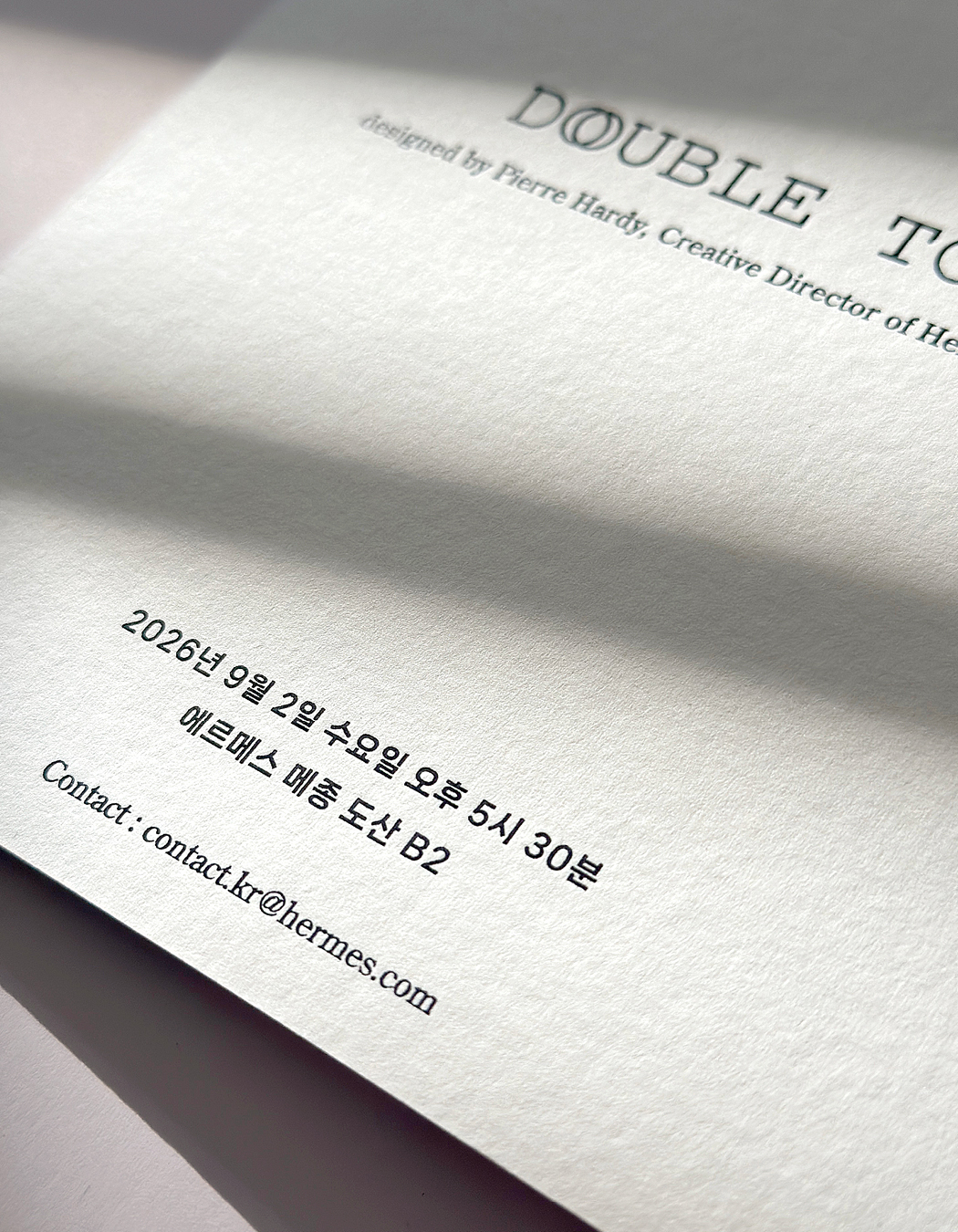
에르메스 ‘DOUBLE TOUR’ 행사를 위한 초대장의 한글 타이포그래피 로컬라이징과 제작을 진행했습니다. 원본 디자인의 정돈된 구성과 여백을 유지하면서, 한글이 영문 타이틀 및 본문과 자연스럽게 어우러지도록 시각적 균형을 조율했습니다.
HEXAIN undertook the Korean typography localization and production of invitations for Hermès’ “DOUBLE TOUR” event. Preserving the original design’s clean composition and generous white space, we carefully balanced the Korean typography with the English title and body text.
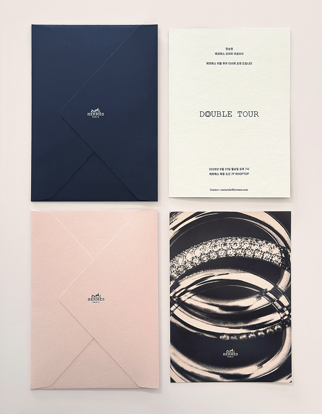
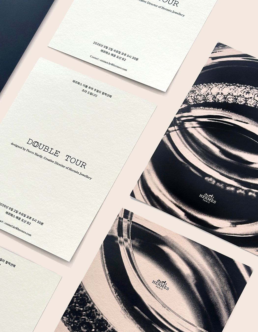

초대장 본문의 모든 타이포그래피는 블랙 핫스탬핑(박) 가공으로 완성했습니다. 종이의 부드러운 질감 위로 글자의 선명한 윤곽과 은은한 광택이 드러나며, 간결한 구성 안에서도 소재와 가공의 섬세한 차이를 느낄 수 있도록 했습니다.
All typography on the invitation’s text side was rendered in black hot stamping. Crisp letterforms and a subtle sheen contrasted with the paper’s soft texture, bringing out the nuances of material and finish within a restrained composition.

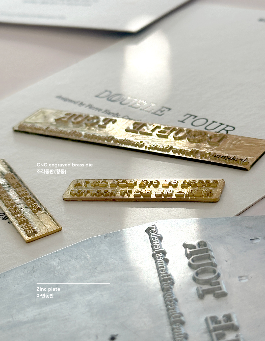
특히 작은 글자와 가는 획까지 정교하게 표현하기 위해, 아연판 대신 황동을 CNC로 정밀 가공한 조각동판을 사용했습니다. 한글의 세밀한 자소와 영문 세리프의 형태, 글자가 종이에 눌리는 깊이감까지 고려하여 타이포그래피의 완성도를 높였습니다.
To reproduce small text and fine strokes with precision, we used CNC-engraved brass dies in place of zinc plates. Particular attention was paid to the intricate forms of Korean characters, the English serifs, and the depth of impression in the paper, refining every detail of the typography.
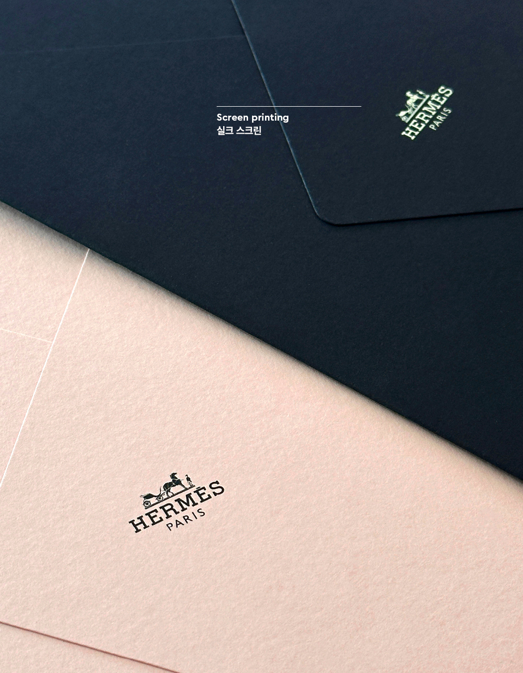
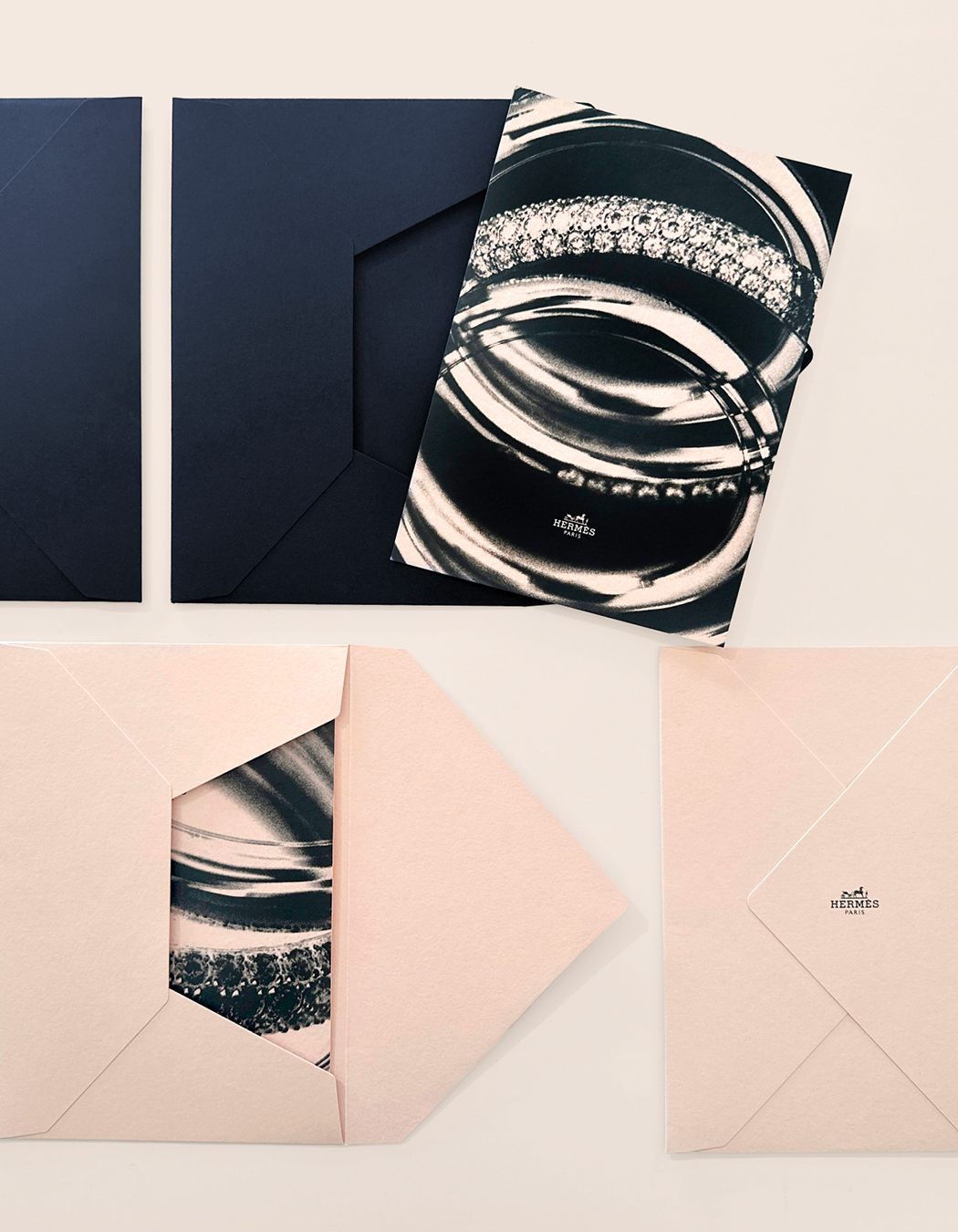
네이비와 핑크 봉투에는 실크스크린으로 브랜드 로고를 표현해 초대장과 조화를 이루도록 했습니다. 한글 서체의 균형부터 판재와 가공 방식까지 세심하게 다루며, 에르메스의 미감을 종이 위에 정교하게 구현한 프로젝트입니다.
The navy and pink envelopes featured screen-printed Hermès logos, complementing the invitations. From typographic balance to die selection and finishing techniques, each detail was carefully considered to translate the Hermès aesthetic into a finely crafted printed piece.
- 다음글아메리칸 버거위크 10주년 26.09.15
댓글목록 0
등록된 댓글이 없습니다.